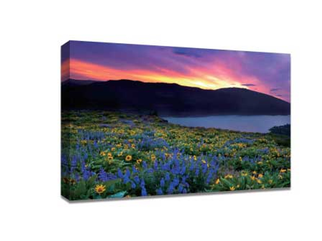
How to Use Color to Enhance the Style of Photos
Color isn’t just a visual element—it’s a language. The right color choices can make your photo feel warm and inviting, mysterious and moody, or bold and energetic. Whether you’re capturing nature, portraits, or abstract images, color has the power to evoke emotion and tell a story. And when you translate those colors onto a physical medium—like high-quality canvas prints online—the impact can be even more striking. By mastering color in your photography, you can create images that not only look good on screens but also become timeless pieces of wall art.
1. Understanding Color Theory for Photography
Before diving into advanced techniques, you need to understand the basics of color theory. In photography, color theory helps you choose palettes that complement each other and enhance the visual mood.
-
Primary Colors: Red, blue, yellow—these are your base building blocks.
-
Secondary Colors: Green, orange, purple—created by mixing primary colors.
-
Complementary Colors: Colors opposite on the color wheel (e.g., blue and orange) create strong contrast and visual tension.
-
Analogous Colors: Colors next to each other (e.g., blue, teal, green) create harmony and subtle beauty.
Pro Tip: Use a color wheel app to test combinations before you shoot.
2. Using Warm and Cool Tones to Set the Mood
Colors fall into two main categories:
-
Warm Colors: Red, orange, yellow—these create energy, warmth, and passion.
-
Cool Colors: Blue, green, purple—these give a calm, soothing, and peaceful feeling.
If you’re photographing a beach sunset, warm tones will emphasize romance and vibrancy. A forest in the early morning? Cool tones enhance the quiet, serene mood.
Example in Practice:
-
Warm Tone Photo: A couple holding hands at golden hour.
-
Cool Tone Photo: Snow-covered trees under a pale blue sky.
3. Leveraging Color Contrast for Impact
One of the most powerful ways to make your subject stand out is by using contrasting colors. For example:
-
A bright yellow umbrella in a rainy, grey street scene.
-
A red dress in front of a teal wall.
This not only draws attention but also adds drama to the image.
Editing Tip: Even if the contrast wasn’t perfect in-camera, you can adjust hue and saturation in editing software to amplify it.
4. Creating Mood with Monochromatic Colors
A monochromatic color scheme uses different shades of the same color. This style creates visual consistency and can feel minimalist yet powerful.
-
Example: A portrait bathed in different shades of blue, from pale sky tones to deep navy shadows.
Monochromatic schemes are especially impactful for canvas prints, as they provide a cohesive, artistic feel perfect for modern interiors.
5. Color and Emotional Storytelling
Every color carries emotional weight:
-
Red: Love, excitement, danger
-
Blue: Calmness, trust, sadness
-
Yellow: Happiness, optimism, energy
-
Green: Nature, growth, renewal
-
Purple: Luxury, mystery, creativity
When planning your shoot, think about the emotion you want to convey, then select a dominant color to match that feeling.
6. Post-Processing for Color Enhancement
Even with great in-camera colors, post-processing allows you to fine-tune the mood and style:
-
Increase saturation for bold, vivid photos.
-
Reduce saturation for a vintage, muted effect.
-
Split toning to add different colors to highlights and shadows for cinematic looks.
-
Color grading to create a signature style for your photography.
Pro Tip: Always calibrate your monitor before editing to ensure colors print accurately on canvas.
7. Preparing Photos for Canvas Printing
If your goal is to display your work through canvas prints, color handling becomes even more important.
-
Use High-Resolution Files: Avoid pixelation.
-
Choose a Print Lab with Accurate Color Reproduction: Not all printing services maintain true-to-life hues.
-
Consider the Room’s Lighting: Warm light can make colors appear yellowish, while cool light can give them a blue tint.
8. Inspiration: Iconic Uses of Color in Photography
-
Steve McCurry’s “Afghan Girl”: The piercing green eyes against a muted red scarf create unforgettable contrast.
-
Annie Leibovitz’s Portraits: Often rich in warm tones to evoke intimacy and connection.
-
Landscape Photographers: Using golden hour light for warm glows or twilight blues for dramatic depth.
Conclusion: Bringing Your Color Vision to Life
Color is one of the most versatile tools a photographer has, capable of transforming an image from “good” to “unforgettable.” By understanding color theory, using contrasts, setting moods, and preparing images for print, you can create photographs that truly connect with viewers. And when you transfer these images onto canvas prints online, you’re not just preserving them—you’re elevating them into works of art that enhance any space.
Recent Posts
-
Why Dog Canvas Prints Make the Perfect Gift for Pet Parents
For pet parents, dogs are more than just animals—they are family members, loyal companions, and a so …18th Mar 2026 -
Black and White vs Color Canvas Prints: Which Creates More Impact for Your Photos?
When it comes to transforming your favorite photos into wall art, one of the biggest decisions is ch …17th Mar 2026 -
Using Canvas Prints to Showcase Your Business’s Brand, Products, or Services
In today’s competitive market, businesses are constantly looking for effective ways to stand out and …16th Mar 2026
